Color Design in the Bedroom: Soothing Tones for Better Sleep

The color scheme in the bedroom plays a crucial role in the quality of our sleep. Colors influence our mood and can either have a calming or stimulating effect. In a room dedicated to rest and relaxation, it is important to choose the right tones to create a peaceful atmosphere. In this article, you will learn which colors are particularly suitable for the bedroom and how to best combine them to promote restful sleep.
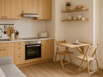
Soothing bedroom decor for relaxation


The best colors for a calming bedroom

Choosing the right colors for your bedroom can have a significant impact on your sleep quality. Soothing colors like blue, green, and soft earth tones are ideal for creating a relaxing atmosphere. Blue is known for its calming effect and is often associated with tranquility and peace. It can help lower blood pressure and slow down the heartbeat, which can lead to a deeper and more restful sleep.
Green, the color of nature, conveys a sense of freshness and renewal. It is an excellent choice for the bedroom as it is both calming and refreshing. Especially pastel or muted green tones can create a harmonious environment that calms the mind and relaxes the body.
Earth tones like beige, sand, or taupe are also excellent options for the bedroom. These colors exude warmth and coziness and can help create a comfortable and inviting atmosphere. They pair well with other colors and offer a neutral base that can easily adapt to different interior styles.
When choosing a color palette, it is important to maintain balance. Too many bold colors can be overwhelming and disrupt sleep. Instead, you should focus on soft, muted tones that promote a calm and relaxing environment.
In addition to wall color, the colors of furniture and accessories also play a role. Bedding, curtains, and rugs in matching shades can complete the overall look and contribute to the desired atmosphere. Make sure the colors are harmoniously coordinated to create a cohesive overall picture.
Color combinations for a harmonious bedroom

The right combination of colors in the bedroom can make the difference between a restless and a restful sleep. A harmonious color palette ensures a balanced and calming ambiance. Here are some tips on how to effectively combine colors to create a relaxing atmosphere.
A classic combination is blue and white. These colors complement each other perfectly and create a fresh, clean feeling. Blue has a calming effect, while white stands for clarity and purity. This combination is particularly suitable for small rooms, as it can visually enlarge the space.
Green and beige are another excellent combination. Green brings the freshness of nature into the bedroom, while beige exudes warmth and coziness. This combination is ideal for a bedroom that should appear both soothing and inviting.
For those who want to add a bit more color, pastel shades are a good choice. Pastel pink and light gray, for example, can create a gentle and romantic atmosphere. These colors are subtle enough not to overwhelm, yet vibrant enough to give the room character.
If you want to be bolder, you can also work with accent colors. A deep dark blue or a rich olive green can be used as an accent wall or in the form of accessories like pillows or curtains. These colors add depth to the room and can look particularly elegant when combined with neutral tones like white or gray.
It is important to ensure that the colors in the room harmonize with each other. Too many different colors can appear restless and disturb sleep. A good rule of thumb is to limit yourself to two to three main colors and complement them with neutral tones. This creates a coherent overall picture that contributes to relaxation.
Tips for Implementing Color Design in the Bedroom

Implementing the color scheme in the bedroom requires a bit of planning and consideration to achieve the desired calming effect. Here are some practical tips that can help you choose the right colors and transform your bedroom into an oasis of tranquility.
Start by selecting a main color that sets the tone for the entire room. This color should be soothing and relaxing, like a soft blue or a muted green. Use this color for the walls or as the dominant hue in the furnishings.
Complement the main color with two to three accent colors that go well with it. These can be used in the form of bedding, curtains, rugs, or decorative pillows. Make sure the accent colors complement the main color and do not compete with it.
Utilize the power of textures to create depth and interest. Different materials like wood, linen, or velvet can enhance the color palette and give the room a cozy touch. A wooden bed frame or a soft rug can further emphasize the calming colors.
Lighting also plays an important role in the color scheme. Choose warm, soft lighting to enhance the soothing effect of the colors. Dimmable lamps or candlelight can create a relaxing atmosphere and bathe the room in a gentle glow.
Don't forget to include the ceiling in the color scheme. A light ceiling can make the room appear larger, while one painted in a soft hue can have a cozy, enveloping effect.
If you're unsure which colors go best together, you can use color samples to try out different combinations. You can hold these samples against the wall or place them on furniture to see how they look in the room.
With these tips, you can effectively implement the color scheme in your bedroom and create an environment that promotes your sleep and helps you relax.
Frequently Asked Questions About Color Design in the Bedroom
For a bedroom, calming and relaxing colors are best suited. Blue is one of the most popular colors as it is associated with tranquility and peace. It can help lower blood pressure and slow down the heartbeat, which can lead to better sleep. Green is also an excellent choice as it brings the freshness of nature into the bedroom and is both soothing and refreshing.
Earth tones like beige, sand, or taupe are also ideal as they exude warmth and coziness. These colors pair well with other tones and offer a neutral base that can easily adapt to various interior styles.
Pastel shades like soft pink or light gray can create a romantic and relaxing atmosphere while being subtle enough not to overwhelm.
It's important to harmoniously combine the colors in the room to create a calm and relaxing environment. Too many bold colors can be overwhelming and disturb sleep. Therefore, one should focus on soft, muted tones.
To create a harmonious atmosphere in the bedroom, it is important to combine colors carefully. A proven method is to use a main color that sets the tone for the entire room and complement it with two to three accent colors.
A classic combination is blue and white. These colors complement each other perfectly and create a fresh, clean feeling. Blue has a calming effect, while white stands for clarity and purity. This combination is particularly suitable for small rooms, as it can visually enlarge the space.
Green and beige are another excellent combination. Green brings the freshness of nature into the bedroom, while beige exudes warmth and coziness. This combination is ideal for a bedroom that should appear both calming and inviting.
Pastel shades like pink and light gray can create a gentle and romantic atmosphere. These colors are subtle enough not to overwhelm, yet vibrant enough to give the room character.
It is important to ensure that the colors in the room harmonize with each other. Too many different colors can appear restless and disturb sleep. A good rule of thumb is to limit yourself to two to three main colors and complement them with neutral tones.
Lighting plays a crucial role in color design in the bedroom, as it can influence the effect of colors. Warm, soft light can enhance the calming effect of colors and create a relaxing atmosphere.
Dimmable lamps are an excellent choice as they allow you to adjust the light intensity as needed. In the evening, you can choose a gentle, subdued light that prepares the body for sleep, while during the day, you can use brighter light for activities like reading or dressing.
Candlelight can also create a cozy and relaxing atmosphere. It is ideal for evenings when you want to unwind and relax.
The placement of light sources is also important. Indirect lighting, such as that created by wall lamps or light strips hidden behind furniture, can bathe the room in a gentle light and highlight the colors of the walls and furniture.
It is important to ensure that the lighting does not distort the colors in the room. Cold, harsh light can make colors appear pale and unattractive, while warm light makes colors appear softer and more inviting.
Overall, the lighting in the bedroom should be chosen to support the desired atmosphere and optimally showcase the colors.
Accent colors are an excellent way to add depth and interest to the bedroom without affecting the soothing effect of the main colors. They can be used in the form of accessories such as pillows, curtains, rugs, or artworks.
One way to integrate accent colors is by using an accent wall. This can be painted in a bolder color that stands out from the rest of the walls but still harmonizes with the main color. A deep dark blue or a rich olive green can be used as an accent wall to add depth to the room.
Accessories in accent colors can also make a big difference. Pillows in a bold hue or a rug with an interesting pattern can give the room character without disturbing the calming atmosphere.
It is important to ensure that the accent colors complement the main colors and do not compete with them. A good rule of thumb is to limit yourself to one or two accent colors and use them sparingly to create a cohesive overall look.
With accent colors, you can also make seasonal changes in the bedroom. In summer, bright colors like yellow or turquoise can provide freshness, while in winter, warm tones like red or orange can exude coziness.
Overall, accent colors offer a flexible way to personalize the bedroom and give it a personal touch.
Textures play an important role in designing a soothing bedroom, as they can add depth and interest to the colors. Different materials can enhance the color palette and give the room a cozy touch.
Wood is an excellent material that pairs well with calming colors. A wooden bed frame or a wooden nightstand can bring warmth and naturalness to the room. Wood pairs well with soft colors like blue or green and enhances the calming effect of these tones.
Linen is another material that complements soothing colors. Linen bedding or curtains can give the room a light, airy atmosphere. Linen has a natural texture that harmonizes well with soft colors and creates a relaxing environment.
Velvet is a luxurious option that can add an elegant touch to the bedroom. A velvet cushion or chair in a soft hue can add depth to the room and enhance the calming effect of the colors.
A soft rug can also contribute to the coziness of the bedroom. A rug in a neutral tone or with a subtle pattern can underscore the soothing atmosphere and make the room feel more inviting.
Overall, the textures in the bedroom should be chosen to support the calming effect of the colors and create a harmonious environment. Different materials can help make the room more interesting and give it a personal touch.
The ceiling is often overlooked in bedroom color schemes, but it can have a significant impact on the overall effect of the room. A well-designed ceiling can make the space appear larger or create a cozy, enveloping atmosphere.
A light ceiling, painted in white or a very light shade, can visually enlarge the room and provide an airy feel. This option is particularly advantageous in small bedrooms, as it makes the space appear more open and spacious.
For a cozier atmosphere, the ceiling can be painted in a soft shade that harmonizes with the walls. A light blue or a gentle green can have a calming effect and make the room feel more inviting.
Another option is to use patterns or textures on the ceiling. Wood paneling or wallpaper with a subtle pattern can add character to the room and complete the color scheme.
It's important to ensure that the ceiling harmonizes with the other colors in the room. A well-designed ceiling can complement the bedroom's color palette and contribute to the desired atmosphere.
Overall, the ceiling should not be neglected, as it is an integral part of the room's design and can have a significant impact on the overall effect of the bedroom.
Color samples are a useful tool for making the right color choice for your bedroom. They allow you to try out different colors and combinations before making a final decision.
Start by selecting some color samples in the shades you are considering. You can get these samples at hardware stores or specialty shops. Be sure to choose both main colors and possible accent colors.
Bring the color samples into your bedroom and hold them up to the walls to see how they look in the room. Make sure to view the samples under different lighting conditions, both in daylight and artificial lighting. Colors can appear different depending on the light source, so it's important to view them under various conditions.
You can also stick larger sample pieces to the wall to get a better impression of how the color looks on a larger surface. This can help you better assess the impact of the color in the room.
If you're unsure which colors go best together, you can lay the samples side by side to see how they harmonize. Make sure the colors complement each other well and create a calming atmosphere.
Color samples offer a flexible way to try out different options and make the best color choice for your bedroom. They help you make an informed decision and ensure that the chosen colors achieve the desired effect.
Furniture and accessories play a crucial role in the color scheme of the bedroom, as they can complement and enhance the chosen color palette. They help create the desired atmosphere and give the room a personal touch.
The colors of the furniture should harmonize well with the walls to create a cohesive overall look. A wooden bed frame or a bedside table in a warm wood tone can enhance the calming effect of soft wall colors like blue or green.
Accessories such as bedding, curtains, and rugs offer the opportunity to integrate accent colors into the room. Cushions in a bold color or a rug with an interesting pattern can add character to the room without disturbing the calming atmosphere.
Artworks or decorative items can also contribute to the color scheme. A picture in matching tones or a vase in an accent color can complete the overall look and give the room a personal touch.
It is important to ensure that the furniture and accessories complement the main colors of the room and do not compete with them. A good rule of thumb is to limit yourself to one or two accent colors and use them sparingly to create a cohesive overall look.
Overall, furniture and accessories significantly contribute to the color scheme in the bedroom and help create the desired atmosphere. They offer the opportunity to personalize the room and give it a personal touch.
More Products In This Theme


Brilliant ideas for every room
-400x300.png&w=992&q=75)


by Amelia Ford
Amelia Ford blends aesthetics with craftsmanship – not only is she a passionate interiors writer, she’s also a trained specialist in textiles and materials. For Amelia, room design begins with touch: How does a fabric feel? How does a surface reflect light?Her articles explore the sensory impact of materials – from the soft elegance of velvet to the cool clarity of glass and the grounded texture of natural stone. By pairing these elements with different interior styles – from classic British to Scandi-inspired – she creates concepts that are both functional and emotionally engaging. For Amelia, decoration is never just an afterthought – it’s an essential part of a well-balanced space.
Off-duty: Amelia lives in a lovingly restored Victorian terrace in Manchester. Her walls are adorned with carefully selected artwork, and her shelves are filled with fabric swatches, design books and handmade decorative pieces. She loves travelling to Scotland to discover new materials and connect with local craftspeople.
Transparency note: Amelia Ford writes her articles with lots of love – and a little help from AI.